Evangelizing for UX Without Overwhelming Your Organization

evangelism_evangelize_ux

So you’re organization wants to get started with UX? Maybe your CMO heard about it at a buzzword-filled session at some marketing conference or as a designer you’re tired of designing, by committee, things that don’t meet user’s needs, or maybe, you’re somewhere in between? Whatever the case, you’ve found yourself at the front lines of advocating for this new approach and all that comes with that. Ok. So do you want the good news or the bad news first?

Bad news…?

Alright. Like me, you like to get that out of the way. Understood.

The bad news is that it’s going to take a lot of time, a lot of passion and a lot of energy. However, you might also find yourself here, because I learned that I liked promoting and talking about UX as much as I liked sitting down with a Brian Eno/Harold Budd record and a hot cup of Kona blend to design (actually, maybe even a little more).

The good news is actually pretty great news.

UX has a value proposition that’s pretty hard to argue with, at even the most change-averse organizations.

As with everything, though, there’s a balance. How do you evangelize for the value of UX without overwhelming the organization?

With all of the day-to-day activities it can be hard to introduce new processes, especially if an organization doesn’t think that there are any issues with the current processes and it looks like you’re adding a greater degree of complexity for no apparent value. No worries, but do keep this in mind: Organizations, like people, generally resist change, so like with any kind of change, the less scary you can make something, the better.

The Problem

Before doing anything with UX you have to establish what the problem is. And even though, you, as a designer, are most familiar with the users, and most sympathetic to their needs, and all of your education and experience tells you what the problem is, you have to make the adoption of UX, not about your opinion, or your feelings, but about user problems based on usage data.

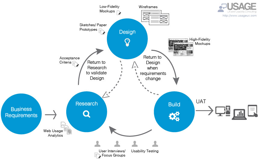
Hopefully, you’ve been tracking stuff with Google Analytics, or an occasional survey or maybe some other voice-of-customer feedback tool; if not, no problem, there are a variety of tools you can use to get started. A few examples are: Google Analytics, GoogleDrive surveys, do-it-yourself user interviews, and A/B tests based on paper prototypes. These are quick and dirty ways to begin collecting data on your users, but usually, it doesn’t take a ton of data to begin to see issues, patterns and the areas of discontent for users. Start collecting the data.

Now that you have some usage data it’s time to highlight the issues and to talk about the solution, which is building the UX discipline into your organization.

The Solution

Evangelizing for UX in organizations that already understand it and think it makes a lot of sense are not really the target audience here, so we’re going to focus on the other kind: The organization that doesn’t understand UX and finds any kind of operational change suspect.

Getting an organization interested in UX is a journey of a thousand miles, with each conversation about user data, each shared interaction on user pain and each reference to the concept of ‘user experience’ being a single step. For my mind, the slow-grow approach of evangelizing for UX is the only way, because an organization that goes too fast will get operational whiplash. We don’t want that.

As I stated at the outset, UX creates a value proposition that’s hard to argue with, but people don’t know what they don’t know, and it’s your job to teach them.

With that said, some folks will still try to argue the value of UX. You’ll hear things like “Why would we do this? The users are happy.” Or, “the users don’t care.” Or, perhaps, my favorite “This is the way we’ve always done it, why should we change?” These are not qualitative arguments, these are barely opinions, mostly they’re smokescreens meant to discourage you. Don’t be discouraged. You have your data, you know where the users are struggling and best of all you have a solution to fix it.

The Practice

Often, there’s the question of where one should start with UX and I believe that you should start right where you’re at.

First and foremost, you can talk a lot about UX, but if you can show the results that’s even better… as the saying goes, ‘show, don’t tell.’ Look at ways to integrate paper prototypes into design discussions. Conduct A/B tests internally with fellow employees and organizational leaders. Use low-res mock-ups or wireframes and talk through the interactions. Getting started with UX can be very low-tech and yield incredibly satisfying results, as well as creating positive experiences/stories that will be shared throughout the organization.

At work here, also, is the idea of creating ambassadors for organizational change. I originally heard Eric Quint, Chief Design Officer of 3M talk about this at an O’Reilly Design Conference and it really stuck with me.

The idea is this: The square root of an organization’s employees equals the number of ambassadors needed for organizational transformation. So, if you have 1,000 employees, then you need 31 ambassadors/influencers talking about an idea to effect organizational change. While I never heard of an equation for organizational transformation put just this way, it’s darn accurate in my experience.

The funny thing about the actual practice of UX is that somewhere between getting started, unofficially, just to ‘see how it works’ and full-blown processes being established the discipline of UX takes root. I’m sure it could go the other way, but that’s just never been the case for me. When organizations start to see the positive results of UX and the empathic consideration of a user perspective, it’s as if some area of our lizard brain is triggered, with even those most opposed to the change, getting involved in serving the user. It’s radical and adoption of UX slowly takes hold.

I’m sure there are other, top-down ways to introduce UX. There can be mandates given and directives written, but UX, like any organizational change works best if it happens organically. Whether we’re talking UX or picking a new office supplies vendor, there are varying levels of awareness, acceptance and adoption. In this regard, organizational change works best through gradual repetition and iteration. The worst thing that can happen is that an organization gets overwhelmed by change, UX or otherwise. UX can be a lot of fun, and mostly, folks want to help one another, the user-centered perspective of UX makes it a great practice, not just for making better products, but for bringing people together to solve a common problem.

Takeaways

Do:

  • Collect usage data (web analytics, DIY surveys, voice-of-customer feedback)
  • Show, don’t tell whenever possible
  • Have fun spreading the word of UX with fun exercises
  • Create UX ambassadors

Don’t:

  • Get frustrated if change doesn’t happen quickly
  • Lose sight of your UX goals
  • Give up


Lean UX and agile – The one-two punch to quickly knock out great work!

usage_lean_ux_agile_diagram

It’s probably because it’s something I do everyday. I don’t think much about it. Or, maybe, I don’t want to think much about it, because day in, day out, it’s where my focus is. However, I do think that it’s supremely important… I’m talking about integrating UX into agile.

One day I’ll probably write a book about it. I love giving practical advice and sharing my experiences, in fact, that’s one of things about agile that I really love, the community-based, open source aspect of the community around agile. Whether you’re looking at scrum, kanban, scrumban, or something else, agile is a great way of working with your development team and it’s also excellently positioned to take advantage of UX practices.

Specifically, (WARNING: Much jargon ahead) I’m a fan of Lean UX, say, as opposed to, agile UX, which honestly, it looks like it is falling out of favor for some of the reasons that the Nielsen/Norman group captured here in their article Doing UX in an agile world, specifically:

…most teams don’t conduct user research on a consistent basis, if at all. People cite tight deadlines and staffing shortages as reasons for deficiencies in user-centered activities.

Research and user testing are two areas that are very difficult to integrate into agile UX. Lean UX, on the other hand, considers this, and in some ways is really an agile UX 2.0. This is important, because the need for that research and testing to happen in real time is super important to the ongoing design and development process. Unlike a waterfall approach, there usually haven’t been requirements or JAD (joint application design) meetings; instead, you start with a basic road map, some use-cases, a couple user stories and get to work. Lean UX thrives in this situation.

Ok, I say, Lean UX thrives… yes, that’s true, BUT… teams have to get used to working with one another and they have to round off the rough edges and bad habits, whether of the development or the interpersonal variety. Lean UX and agile don’t leave a lot of margin for getting mired in unnecessary details and some of the interpersonal issues that may pop up when a team is just getting started. Nevertheless, when it comes together, and when the gelling starts, the team’s pace and work can be exceptional!

I find Lean UX or the idea of UX that can work at the speed of agile to be very exciting, especially if you’ve ever been involved in a waterfall development project or something that was just slow moving. Lean UX and agile are the one-two punch to quickly knock out great work!

UX and the 80/20 Rule

8020-Rule-UX

As I’ve written about many times, I’m a great fan of the 80/20 rule in design and UX, also known as the Pareto Principle, and Jennifer Aldrich has written a great article at the InVision blog getting into a specific approach for applying the 80/20 rule within the context of UX.

Ms. Aldrich writes about a multi-step process that has remarkably low overhead for getting at the core of the user experience issues; in this case, the 80/20 rule uses 20% of the effort to get at 80% of the problem. Genius!

As Ms. Aldrich states:

“This method is for those who don’t have a background in research or statistics, or for experienced professionals who just need some quick and dirty data. It’s a powerful, fast, and cheap way to quickly evaluate how you can pack the most UX punch when you’re planning improvements to your product or service.”

Rather than paraphrasing Ms. Aldrich’s informative and well-researched article I’ll simply point the way and say that if you’re interested in understanding the 80/20 rule in the context of UX this is a good read and well worth your time.

UX simplicity is an iterative process


ux_simplicity

When it comes to design, reducing something to its most basic parts is not just a design or aesthetic discipline, but it’s also the discipline of looking at what’s needed rather than trying to imbue the design with what you want.

The best designers know this, maybe intuitively, because at the core of the work they’re doing is the hope that a design, this thing birthed from one’s intellect, takes on a physical life of its own, is used and maybe, if you’re super lucky, brings joy to the user.

So, simplicity, like complexity is all about which direction you take the iterations in. Do you want something with lots features, buttons, screens, etc.? Or, do you want something with a few critical functions that are intuitive, straight-forward and easy to use?

This is the fundamental dilemma of design: Provide many features, which, historically, has implied a greater value, or to minimize, giving only the most important features and perfecting them to ensure the best possible experience.

With each design iteration there’s change, growth and refinement; Simplicity leaves room for things to evolve, organically — I think that perfection is a phantom, but iterations will be what gets you closest to a more perfect design.

Emotional Intelligence at the center of UX

emotional-intelligence-UX-design
Logic meet Inspiration

Emotional Intelligence, in the world of psychology, is a relatively new concept, but EI, or sometimes EQ – Emotional Quotient, is at the center of the user experience. Some folks might think that this is crazy or an extreme extrapolation, but follow me, here… If you look at Daniel Goleman’s Five Components of Emotional Intelligence it’s not a leap to see them as the center of UX:

  • Self-awareness
  • Self-regulation
  • Internal motivation
  • Empathy
  • Social skills

I’ve talked about all of these areas in various posts before:

In fact, emotional intelligence is at the core of the USAGE UX and Usability blog; it’s a constant that runs through all of my thinking, writing and practicing of UX. I’m reminded of the Carlos Castadena quote: “All paths are the same, leading nowhere. Therefore, pick a path with heart!” Or put another way after years of being a designer, manager, etc… A sense of purpose arose out of UX for me, a sense of purpose borne of empathy and emotional intelligence that led towards ‘a path with heart.’

So, when I talk about emotional intelligence being at the center of UX, it’s not just at the center of UX in a practical way regarding the discipline of UX, but it’s also the cornerstone of my personal journey and what’s driven me to undertake this work. I think there are a lot of UX folks who feel this way.

This an unusual post, to be sure, because the only really practical point I make is the connection of UX to emotional intelligence. Maybe that’s enough, for some, maybe not enough for others… It feels slightly inadequate to me, but also important to the ongoing narrative of UX, its growth and its development. We’re actively developing the future of UX as a discipline and as a practice; I find that both an exciting and challenging, because the need for this discipline is so clear, but the challenge is not just changing minds and old practices, but ultimately changing behavior; fortunately this is a path with heart.

The problem with “intuitive” design


intuitive_design

Over the years I’ve talked with many people about creating intuitive designs, making something user friendly, usable, even, in the contexts of websites, apps and products. However, the idea of ‘intuitive’ presupposes that one person is able to nail, completely, what is or is not intuitive without any user perspective. Sure, we can can make some basic deductions about a user experience or user expectations based on what we think we know about a user, but really the smallest bit of scrutiny given to the idea of making something intuitive, makes the entire idea fall apart.

Intuition is based on past experience, conscious or unconscious, cumulatively, and determines some level of expectations.

My ability to pick up an iPad, and “intuitively” complete a task will make much more sense to me than if Benjamin Franklin picked up an iPad and tried to complete the same task. I understand user interfaces. I’ve been steeped in a world of human-computer interaction, it’s a modality for the completion of tasks that I understand. Similarly, old Ben Franklin would be much more adept at lighting, servicing and maintaining a whale-oil lamp than I ever could be. My intuitive iPad is not his intuitive whale-oil lamp. Our experiences and our particular epochs are radically different, so, too, what is intuitive is different.

In order to create something that’s intuitive to your users, you have to meet your users where they’re at. How are they using the design? Where are they using the design? When are they using the design? What tasks are they trying to complete? How do they feel about past iterations of yours or a comparable design for completing the same tasks.

The problem with intuitive design is that it’s not really about intuition at all, but about researching your users, their goals, their biases and generally who they are to determine what the best design solution is for them.

Asking for an intuitive design is a cop out.

Do the work and create the design your audience needs.

Apple had Steve Jobs… UX is for the rest of us…

user_experience_wheelUser-Experience-Wheel

You can’t have it both ways. I mean, you might want to have it both ways, you might think that having it both ways, with some finagling, is possible, even though you know that one might, inevitably, cancel the other out, still you can’t have it both ways.

I’m thinking about something I used to tell clients when doing design work, web or print…  I used to tell them about the ‘wants triangle’… that’s what I called it, somebody with a PhD in economics probably came up with it, but I heard it somewhere, picked it up and made it my own. It went something like this: ‘You can have it quick, you can have it cheap, you can have it good… but you can’t have all three, you have to pick two…’

Now, my argument about wanting both is binary, whereas this equation wasn’t. In both cases, though, client/organization/boss had to make a choice. And decisions, for the majority of us upright bipeds, are things of the greatest difficulty.

So, you can’t have it both ways.

That’s the preface.

When we talk about having it both ways what we’re talking about is making the choice between choosing to adopt UX practices or not.

At this point, not adopting UX if you make websites, software, or really any product that somebody has to use, which, I guess, is almost everything from dishwashers to urinal pucks doesn’t make a lot of sense. Admittedly, safety was never a primary concern for most automobile manufacturers, and when safety standards were finally adopted, these rules had to be foisted upon automotive manufacturers; hard to imagine, now, I know, but alas, that was the case… Cars and safety belts go together like peanut butter and jelly. Similarly, the discipline of UX is kind of inseparable from the reality that users are going to use your stuff… so why not include them in the design process of the thing you’re making. Capital idea!

And yet…

You can’t have it both ways. Well, not exactly, but with maturity you can get pretty close.

I’m talking about the initial adoption and investment in UX, which does slow down the traditional process of the CEO or CMO telling you what kind of website or product they want and telling you to go and make it. The discipline of UX builds in layers that could be construed as slowing things down, but really this investment takes the risk out of something not working or being a flop when it eventually gets released or goes to market… the visionary CEO or CMO’s approach doesn’t. Admittedly, they’ll take the hit (sometimes), but it’s  a huge waste and a bummer to bet the farm on single person’s idea.

Achtung! Or, warning!, for our non-German speakers… In the cult of Steve Jobs, of which there are many supplicants, the idea of being a CEO, CMO or product person that has both business acumen and a strong vision is a very common occurrence, in some ways it feels like a plague… Business acumen, you can learn, vision, on par with Henry Ford, Thomas Edison, Walt Disney and Steve Jobs, uhh… yeah, not so much. Is it genius? I don’t know. There was something going on with these folks, their particular epochs, their experiences and also their locations on history’s timeline, intersecting with technology, curiosity, creativity and sheer force of will… the likes of which can’t be manufactured, thus making the likelihood of running into someone like this or your CEO being one of these people very, very slim. Which brings us back to UX.

UX is for the rest of us, i.e. most of us. UX takes practice, organization and structure, that’s why it’s called a discipline. That’s what is so enduring about it. It’s not a quick shot or injection that will make everything good. It’s transformative and transformation is hard; it’s change. It’s putting the users in charge of the design instead of the CEO, CMO or chief whatever officer… where it should be.

This is what I mean when I say you can’t have it both ways. You can’t have a mature UX practice and process in place without putting in the work. You can’t remove the risk of bad design without a mature UX practice.

You can’t have it both ways.

There’s no shortcut to a mature UX practice.
There’s no shortcut for good design.
There’s a symbiosis where each needs the other.

You need these two things for UX success

user_experience_marathon

User experience, like any change, can take a lot of time, a lot of energy and a lot of persistence. Even in those instances when preparation and opportunity intersect change isn’t easy.  I’m talking about UX, but I could be talking about organizational change of any kind. Sometimes, I feel like this is a perspective that comes with age, something that my younger self, wouldn’t have wanted to hear, but my more seasoned self knows as a fact and embraces accordingly.

In order to be successful with UX, you need to put the energy in and you need to be persistent.

The energy comes in many forms. It’s your passion, it’s your vision, it’s your need to share the idea of UX and push the change forward against bureaucracy and those who aren’t willing to accept any change, and those who feel like you’re presenting hurdles, or unnecessary steps when the old way of doing things will do… But you know that UX isn’t just necessary, it’s important to an organization’s ability to change and grow, and perhaps, most importantly, it’s the right thing for your users.

This is where the second part comes in, because without this one, all of the energy in the world doesn’t matter.

Persistence.

Energy without persistent direction will be put into something else when you want to give up, when you get sick of putting the energy in and getting no positive feedback, no return on time and years of your life invested in the change.

Energy and persistence are the 1-2 punch that no change, no matter how great, can resist. Admittedly, this may seem like an over-simplification as change comes in many shapes and sizes, but at the core, if you can persist and direct your energy accordingly you will make great strides as an agent of change.

Change takes time; Pace yourself, treat yourself well and don’t forget the goal. Remember that change is a marathon not a sprint, and today’s setbacks could be tomorrow’s opportunities to stop, reflect and make course corrections. I wish I had somebody to give me this advice as I embarked on changing organizations, but hopefully I can help somebody in a way that would have helped me by writing down these lines.

When you combine energy and persistence UX change isn’t just possible, it’s inevitable.


Don’t lose your UX to edge cases

ux_edge-cases

Vital to any user experience are the use cases, but sometimes, it is possible to overthink the design, the product, the software, the website, etc… We’re natural born problem solvers, so when we get in that state of mind it’s easy to find a lot of problems that need solving. The problem here is that we can lose ourselves and our user focus in edge cases.

Edge cases are important and play a vital role in determining how outliers and users in the minority might use your design, but we have to play to the 80/20 design rule: Focusing on the needs of 80% of your users.

That’s not to say that we don’t keep track of that 20% minority, or that we don’t capture use cases and put them in our product backlog, but we can’t prioritize edge cases as if they’re critical to making a design “complete”, when they ultimately prolong the shipping of the design.

Shipping the design gets us valuable user input that’s key to a product evolution and refinement, so getting lost in edge cases not only compromises the timeline, but ultimately focusing on edge cases compromises the user experience for the majority of users.

Focus on the needs of the majority of users, apply the 80/20 rule and design the user experience for the majority of users.

Meet me there… UX design and the user environment

user_experience_environment

User experience design requires an empathic, user-centered design perspective.

You have to meet people where they’re at.

Once you’ve completed your user interviews, and finished your personas, use-cases and journey maps, you have to really get inside the mind of the user.

One of the most difficult tasks of the UX designer is trying to not just get in the mind, but also the physical space of where the user experience is happening. Is it a loud manufacturing facility, is it a cramped commuter train, or is it a quiet health facility?

Knowing where the user experience is happening, getting a sense of that environment, even visiting, if at all possible, is the best way to ensure that the user experience is being designed, not just for the right kinds of users, but also for the right kinds of environments. We do it for different mobile devices, screen resolutions and browsers; why wouldn’t want to also design for the physical space?

The short answer is that we would.

Being an empathic and user-centered UX designer means that you have to capture as much as you can about the user, how and where, they interact with your design — The physical environment shouldn’t get any less consideration than any of the other design criteria.